As you all know I've got this "thing" about uniforms.
In many ways a team's uniforms is the uniting factor behind fan support. We may bicker at the pub over who should be starting and why they haven't fired the coach yet, but we'll all do so in the same colours.
Anyone supporting New Zealand against Australia while wearing a yellow shirt will be seriously scrutinised. Not ostracised, but not fully trusted either. (This is not to say I follow uniform changes to make sure I "fit in").
Uniforms are also a way for a team to project an image within certain design constraints. The idea of image is why South Africa has changed the Springbok uniform.
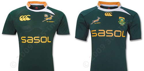
After a long period of political wrangling this will be strip that the Springboks will wear against the B&I Lions and in the tri-nations. The old Springbok (a symbol linked closely to apartheid-era South Africa) has been moved and joined with a large protea logo, rather than the protea being a small part of the main logo.
And for those of you who are wondering, expect the actual playing jersey to have Canterbury's patented "Walla-bra" across the bust.
But New Zealand has been making changes too.

The All Blacks have a new strip that has very little to do with team image, but I'm still unconvinced that it's a completely market-driven move either (though a new jersey will only set you back $180). Management and Adidas wanted to get away from the awful silver and black strip that dogged the last World Cup.
The move to the new white strip was partly in necessity. Nike hasn't changed the French uniform from the very non-traditional navy blue.
The white jersey will only be worn, as required, when the All Blacks are playing outside of New Zealand, in line with the IRB's revised policy of the away team needing to change jerseys in the event of a clash. It will be worn for the first time against France in Marseille this November during the All Blacks' end of year tour.
And we don't want that game to look like this. And also it's tradition:
The 2009 all-white jersey also continues the tradition of famous white All Blacks jerseys of the past, with the All Blacks first donning an all-white jersey in 1930 for the domestic Test series against the touring British Isles team.
Yeah, I am quoting the Adidas press release. Did you know the new jerseys only weigh 195gms!? It's like they're wearing nothing at all.
But, and I realise that you all must think I'm an Adidas shill by now, I really like the white jerseys. They are plain and simple, there are no stupid side panels with different colours, there is no collar sweep to the shoulder and most importantly there is no advertising (well, other than the Adidas logo).
I really like the idea of the All Blacks being a monochromatic team. What that says from an image point of view I don't know, but I love the design aesthetic.
And the boys weren't the only ones getting new duds. The Silver Ferns have returned to the adidas stable and have new merino-polyester unis to show for it.

Again I like the simple, all black, design. Can't say I'm completely sold on the metallic numbers and lettering (though I did like the Aussie cricket team's dark green with metallic gold). The best thing that could be invented for netball uniforms is an absolutely no-fail system to keep the letters on. Velcro ain't doin' it.

Also, why didn't Adidas make the Silver Ferns some shoes too?